Globaleur
Creating a seamless travel planning experience, minimizing time spent on itineraries.
My Role
UX/UI & User research, User testing, Prototyping, Style guide, Branding.
Team
1 UX/UI Designer (me), 1 Product Manager, 1 UX Researcher, 1 Engineer.
Timeline
Apr 2018 - Sep 2018.
Tool
Figma, Adobe XD, Photoshop, Illustrator, Zeplin.
Outcomes

Overview

Globaleur provides digital infrastructure driven by AI for companies in Travel & Hospitality and Mobility. Our initial milestone involved developing Globaleur's mobile app, aimed at swiftly delivering vital travel information to users, enabling seamless and memorable travel experiences.
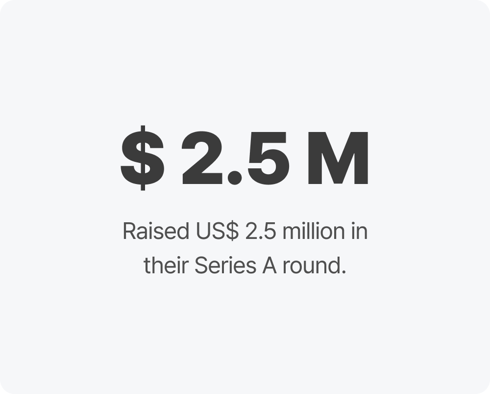
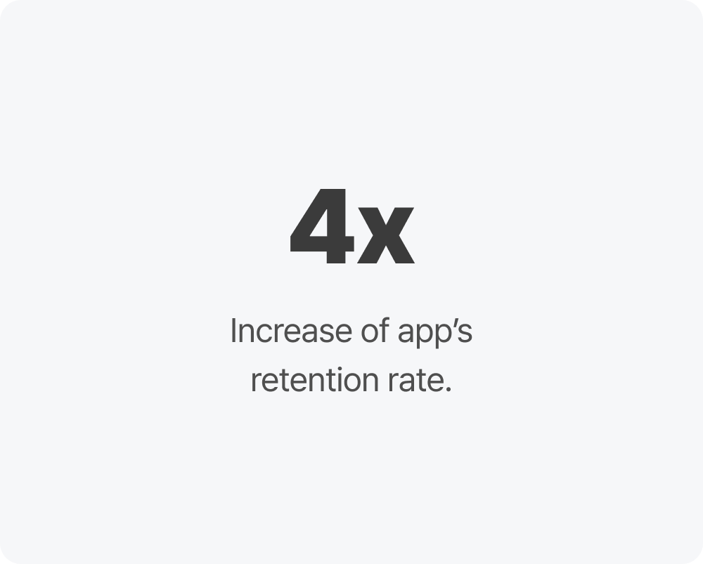
The final product resulted in a $2.5 million investment in Series A funding, quadrupled the app's retention rate, and successfully launched the MVP of the native app design with a 4x increase of the app’s retention rate, earning a perfect 10 rating.
“Rosa has been the greatest contributor to our UI/UX team since the onset of our company's staple mobile app development. Her design can mold into each projects needs, and her capability to add in the perfect amount of UX elements into her design really make a huge difference in her output. Aside from all the great work she produces, she is an amazing communicator. Every member of our team loved working with Rosa for she is good at listening and sharing her opinions in a professional way. Rosa will be a great addition to any team!! I fully support her career and truly wish her all the best in her artistic endeavors!”
-David C. Lee (Founder of Globaleur)-
Problems
Planning for travel is stressful!
Traveling is fun, but planning travel can be stressful, especially when it comes to finding restaurants, navigating unfamiliar places, and dealing with crowds. But as a travel enthusiast, I found it fascinating to work on a project aimed at helping users turn their trip experiences from chaotic to blissful. So, I began pondering:
How can we make it easy for users to plan their travels and spend minimal time on their itineraries?
Solutions
Simplifying Planning for Effortless Adventures is key
The goal was to quickly deliver essential travel information to users, unlocking seamless and unforgettable travel experiences!
Research
I conducted user research in order to identify the key struggles users had when using this product

I did a survey in order to identify user’s travel experience. I was able to identify possible risks and potential needs of product from the data.
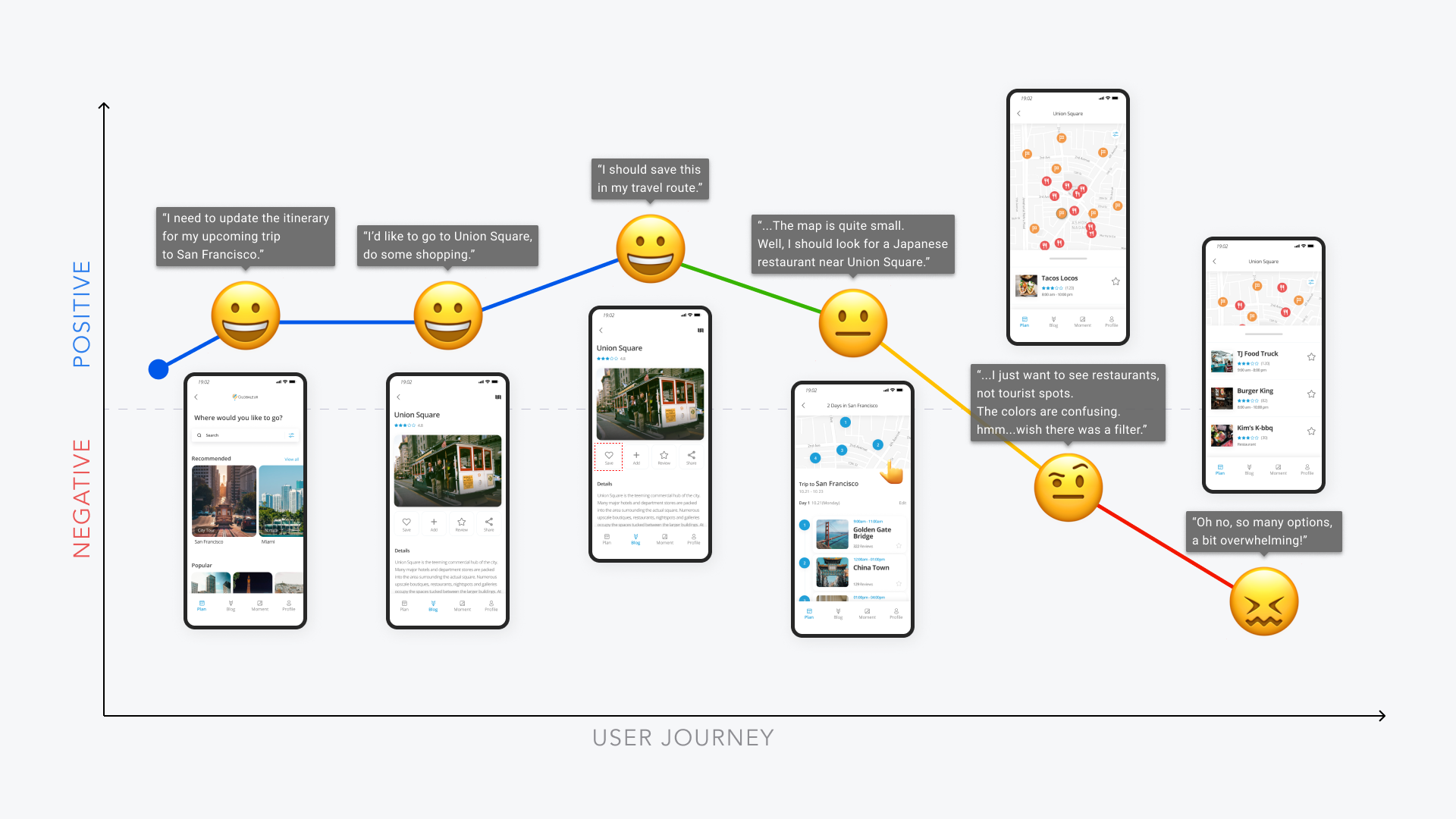
I conducted user journey mapping to identify the positive and negative aspects of the users' journey and determine where to focus my design efforts.
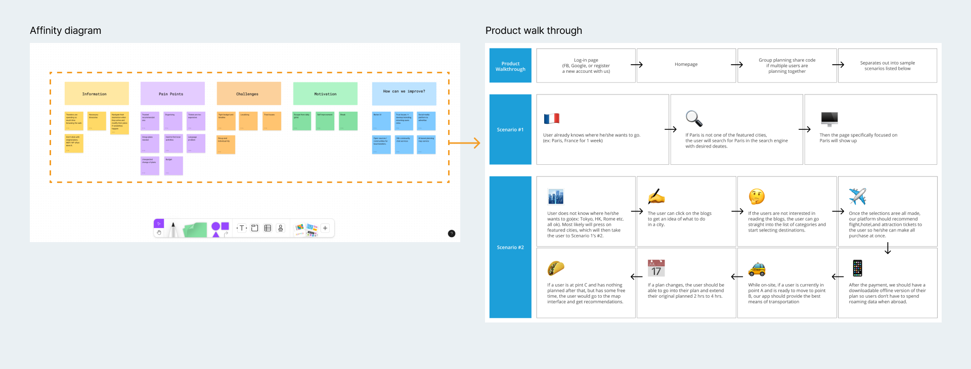
I did affinity mapping in order to identify key trends and patterns with the challenges users were facing.
Takeaways
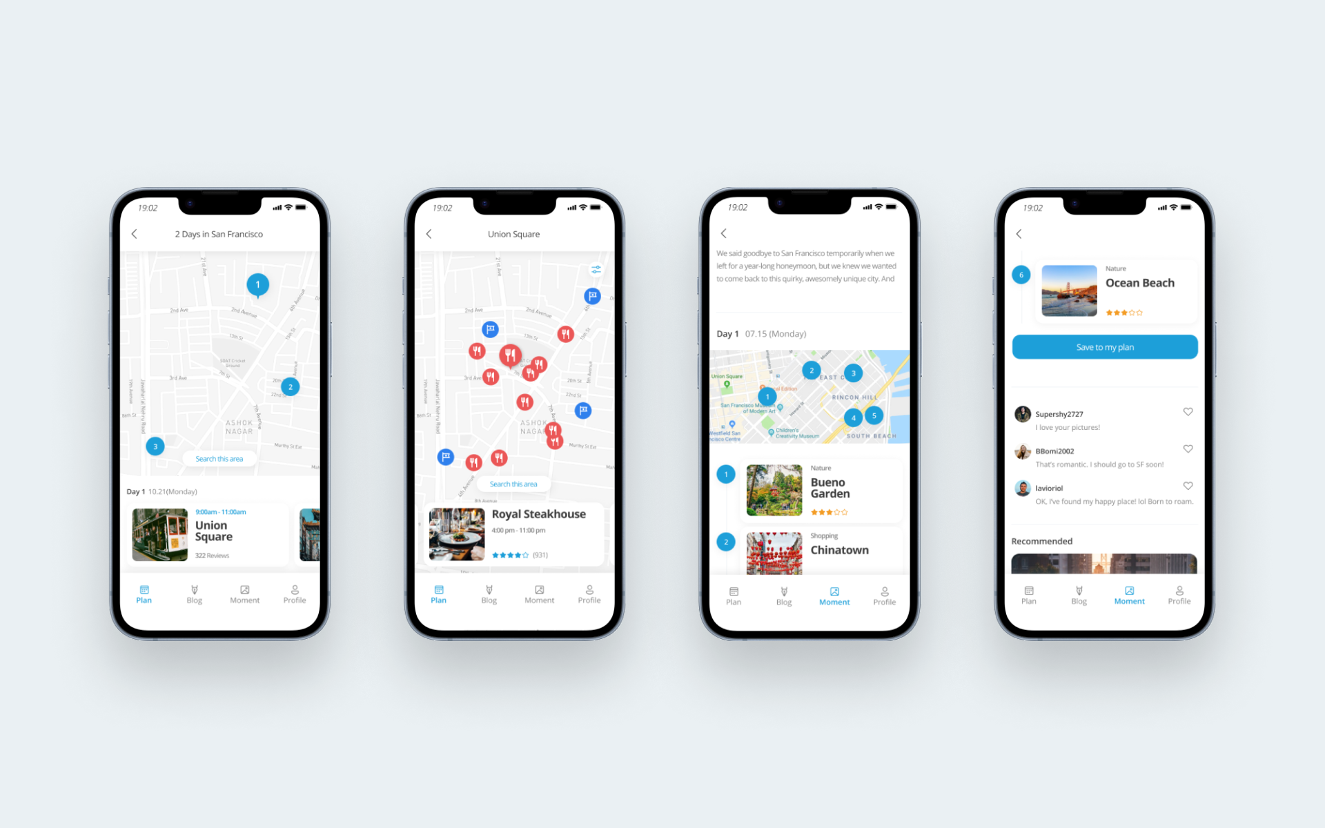
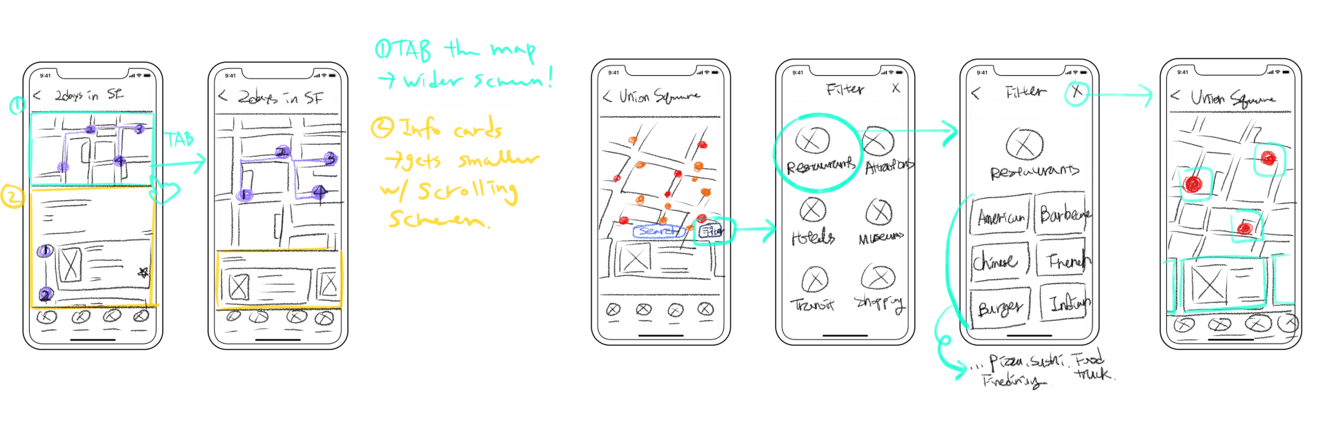
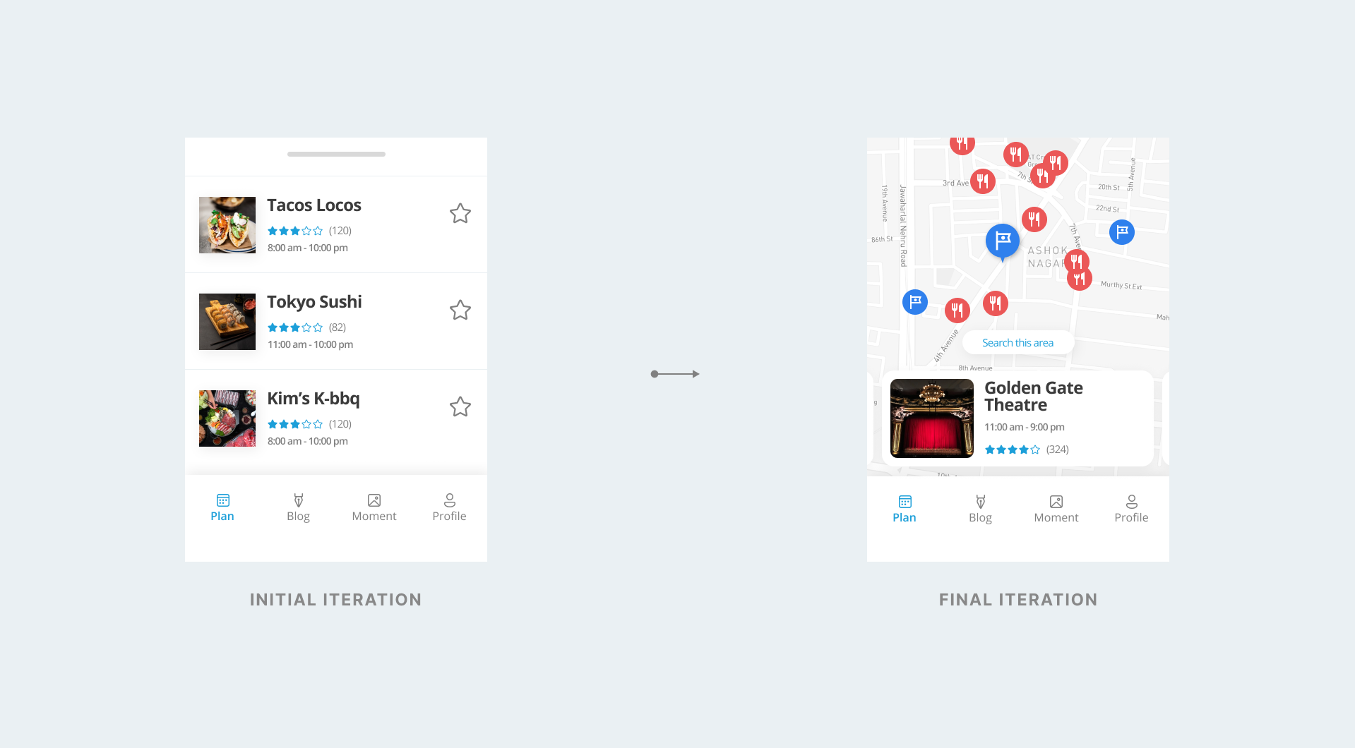
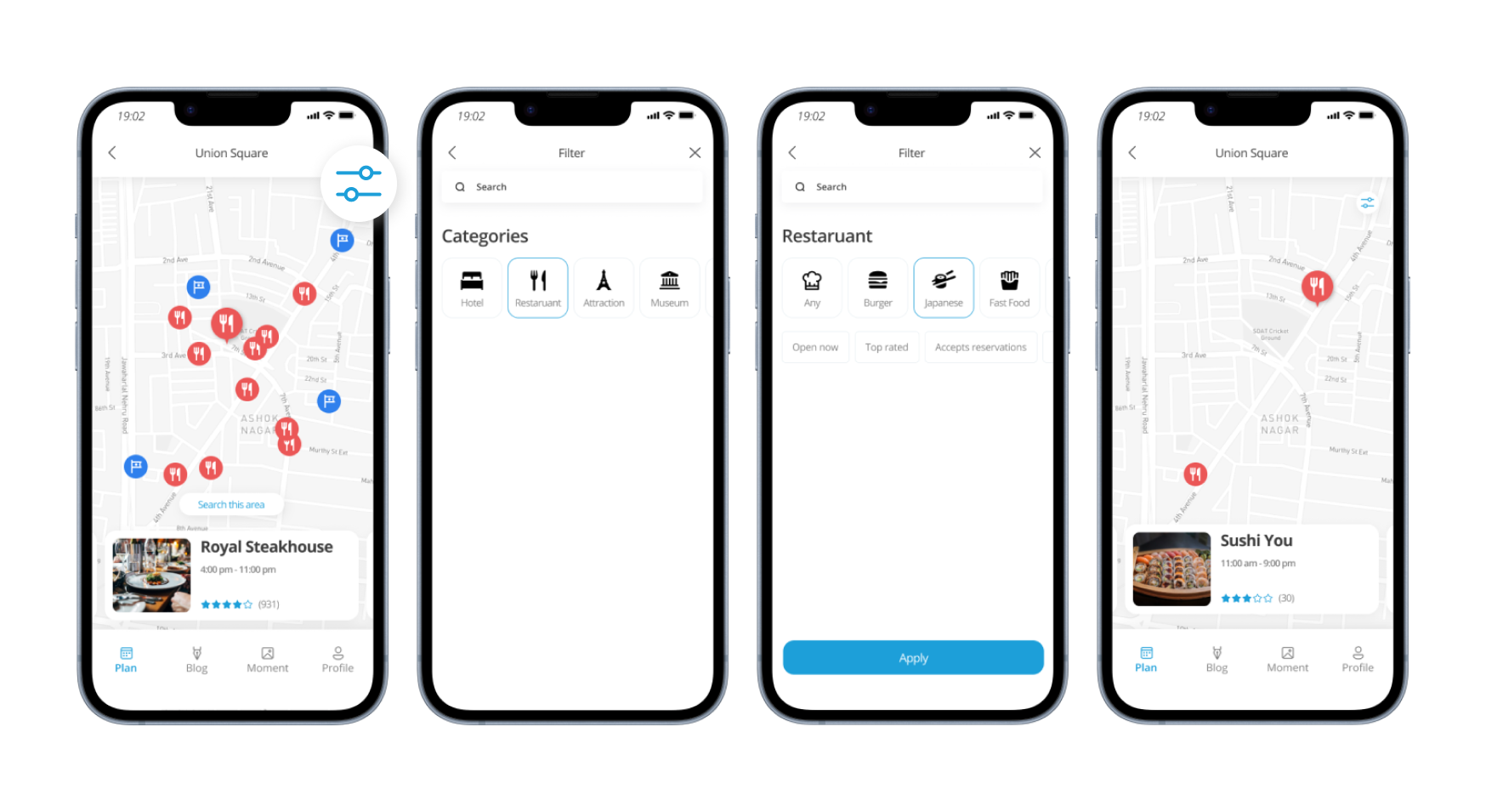
The map screen is too small
The map on the screen is too small, taking up only half of the space, making it cramped and frustrating to navigate with a finger.

Lack of filter
Zooming in for Union Square restaurants, users swipe cards below. But, the mix of restaurants and tourist spots in red and yellow on the map makes it hard to find what users needs.
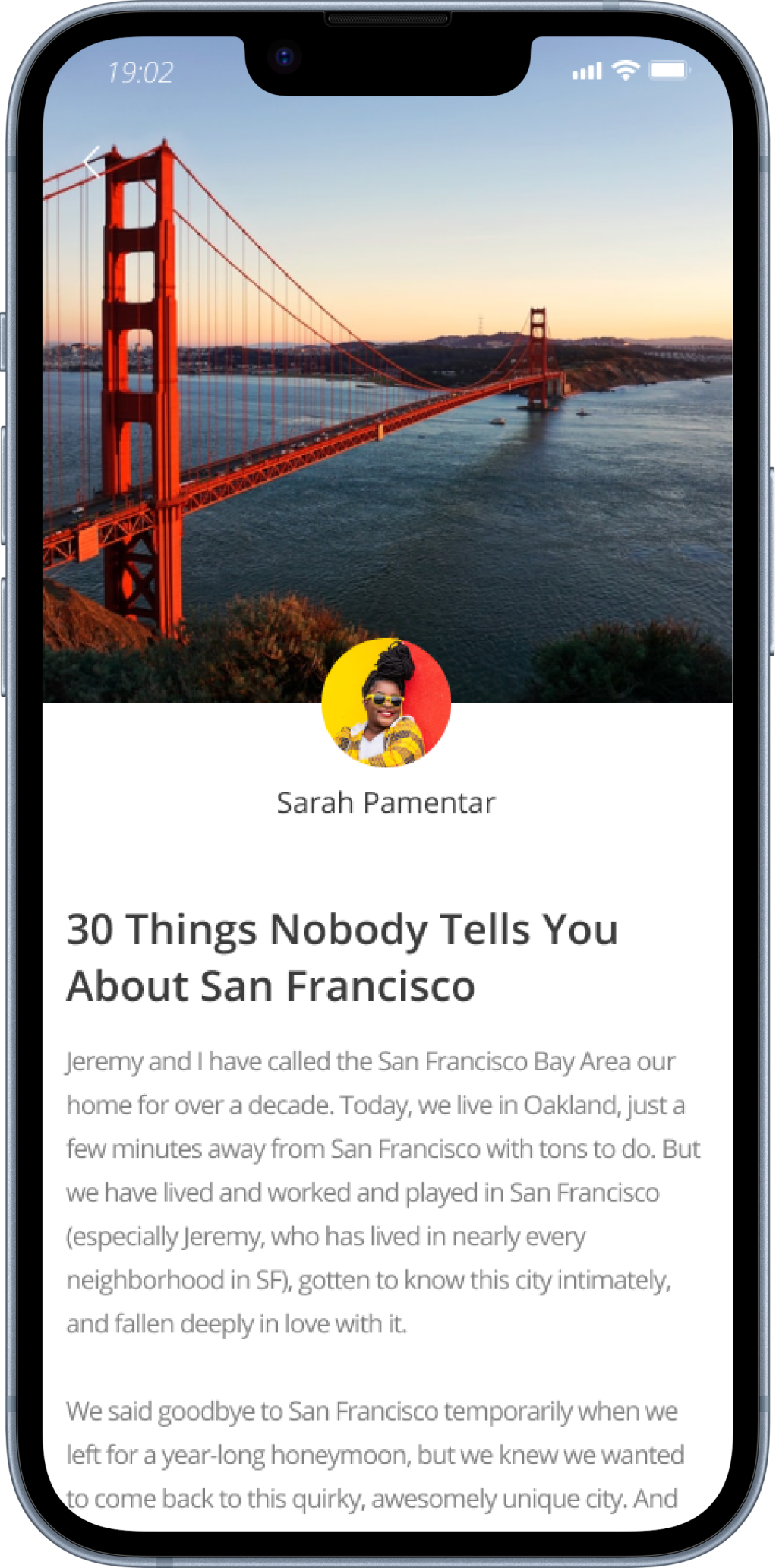
Missing ‘Add to my plan’
Users find it time-consuming to set their schedules due to the hassle or lack of time. This is because they need to read blog posts and manually create their schedules, especially when referencing others' plans.
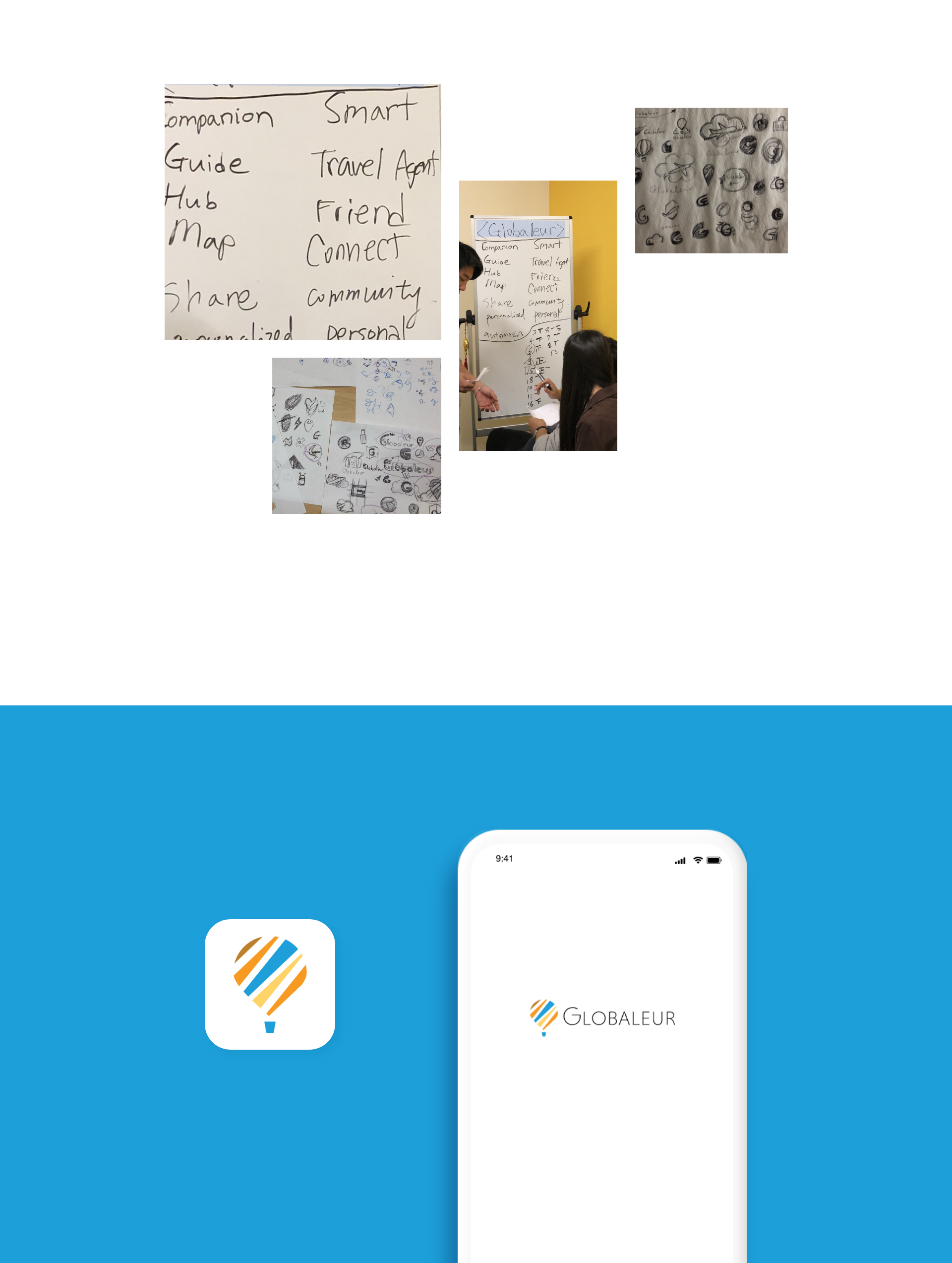
Wireframing
Sketching to create a better experience
I wanted to explore some different layouts and functionality for users to navigate and discover options effortlessly, so I’ve started sketching out some screens on iPad.
Changing Small Details
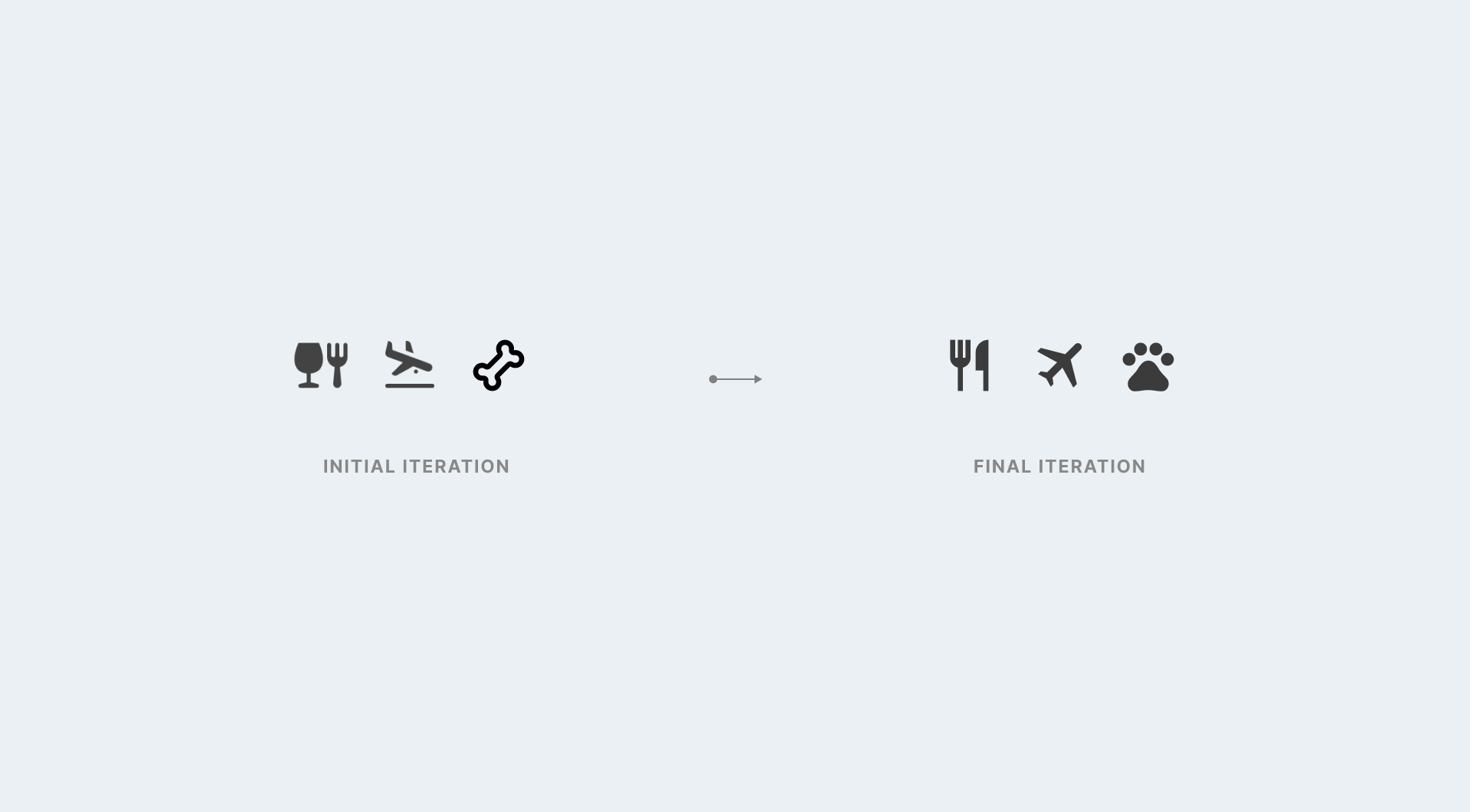
Icon Explorations
I initially designed icons with straightforward visual representations for commonly used categories worldwide.
Cards Explorations
While the card feature on the map is highly noticeable, we ensured it is intuitive for users to access quickly and easy to read. Below are some iterantions I went through to enhance interaction design.
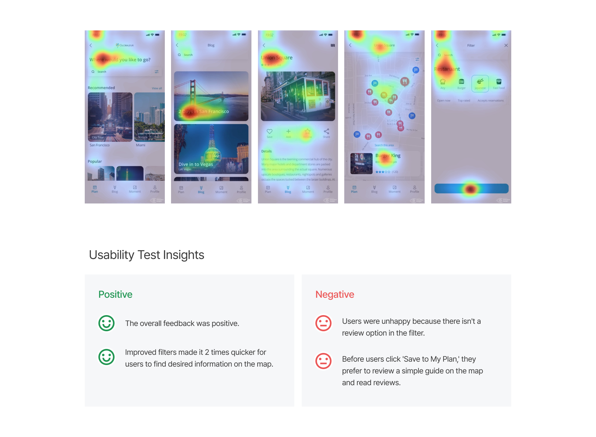
Usability Test
Filters Improved, Reviews Needed
I conducted usability testing with three participants to gather feedback. Overall, users found the improved filters made finding information twice as quick. However, they were unhappy about the lack of a review option and preferred to check a simple guide and read reviews before saving to their plan.
Style Guide
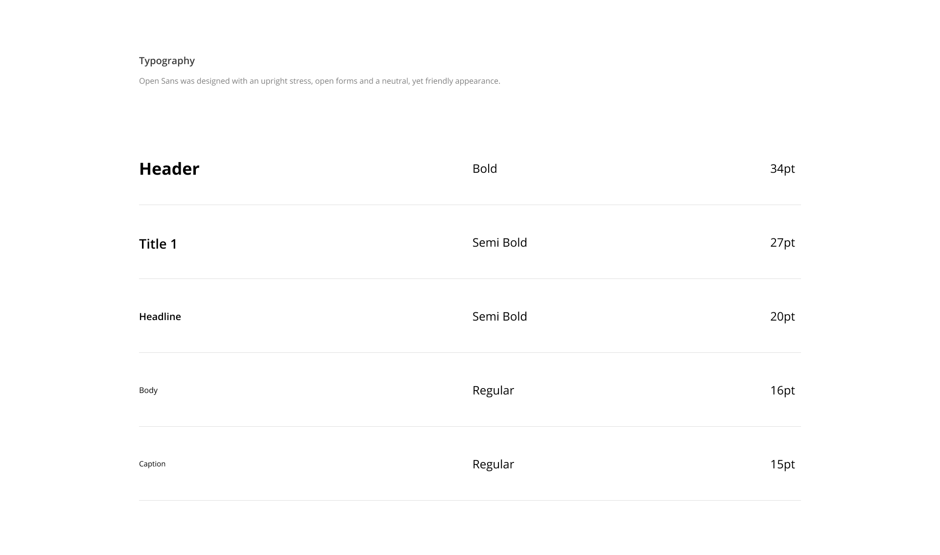
Approachable and minimalist aesthetic vibes!
The final design aimed to be approachable and minimalist. I chose a sans-serif font to convey a neutral and friendly atmosphere. Additionally, I incorporated the original brand colors of primary blue and orange to maintain consistency.


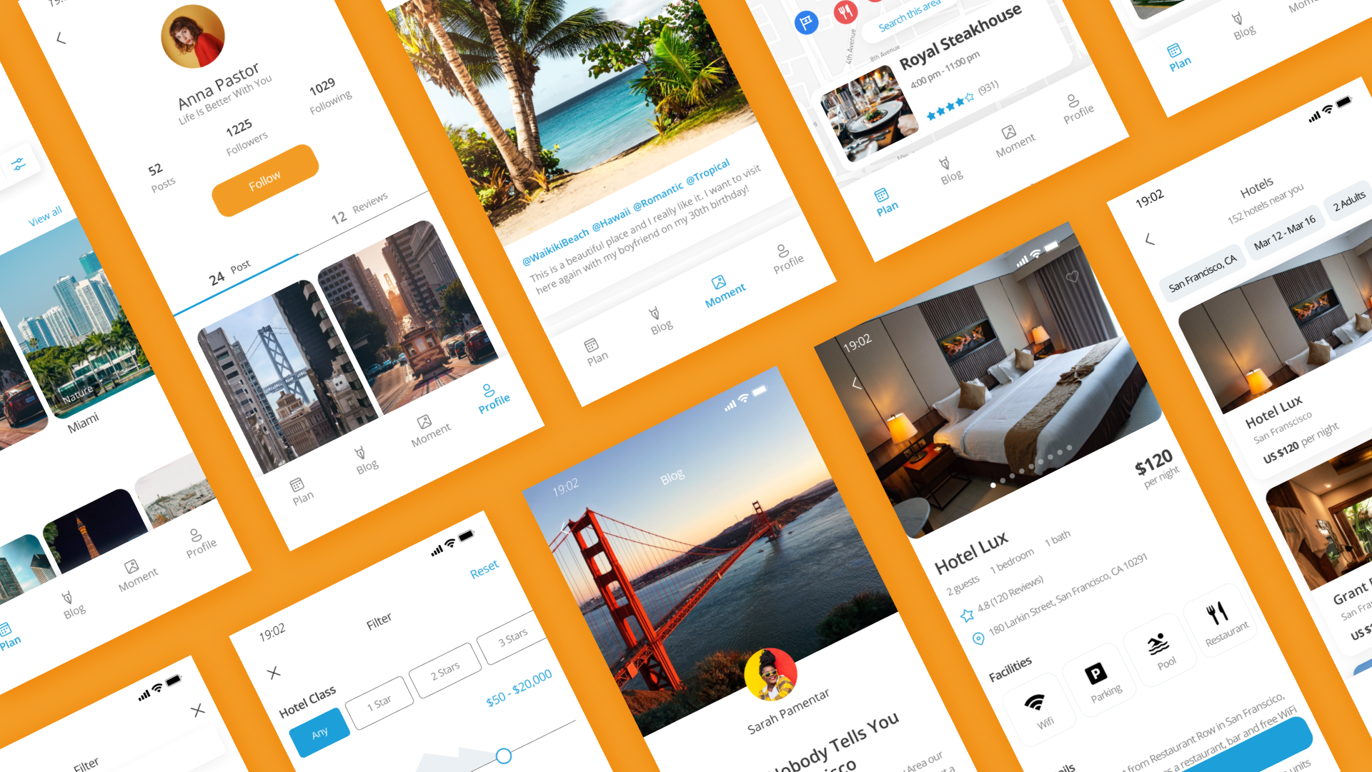
Final Designs
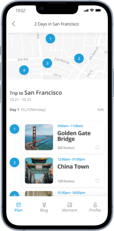
Problem 1
The map on the screen is too small, taking up only half of the space, making it cramped and frustrating to navigate with a finger.
Travel the best route
with better view
When selecting the map area, it enlarges, and the bottom area neatly narrows for a better view.
Results: 4x Increase of app’s retention rate.

Problem 2
All restaurants, from McDonald's to food trucks, use the same icon. Users have to click each one to figure out the type, even when searching for a luxury restaurant.
Simplified Search on Map
We added a filter button to the map screen. Users can now select categories like American, Chinese, or Food Trucks to display only the desired restaurants, making it easier to find specific dining options.
Results: We received over 81% positive feedback from users.
Problem 3
Users find it time-consuming to set their schedules due to the hassle or lack of time. This is because they need to read blog posts and manually create their schedules, especially when referencing others' plans.
Add favorite schedules to your plan
Streamline your planning process by easily importing schedules with a simple 'Save to my plan' feature.
Results: 62% of users reviewed this feature as useful.

Results
What I learned
Launched MVP of native app design, achieving a 0 to 10 rating.
Built the 'Save to my plan' feature.
Raised US$ 2.5 million in their Series A round.
4x Increase of app’s retention rate.
While sketching the paper prototype, I realized it's like a rough draft, not the final version. It doesn't have all the fancy design or technical stuff, which actually makes it great for trying out new ideas early on. This helped a lot in communicating with developers, designers, PMs, and other stakeholders.
Also, I learned there's no one-size-fits-all solution for every product. It's important to design something that fits its purpose and communicate well through detailed plans to make sure it works right. I'm really happy about what I learned and the new skills I gained from this project!